A breath of fresh air for our visual identity and website!
This year, we decided to give ourselves a facelift with a new visual identity and a brand new website. Our goal? To make the experience even more pleasant, colorful and human. All in line with our three strategic pillars: digitalization, sustainability and agility. A major project that we are delighted to unveil to you!
A human and colorful visual identity
The first step in this transformation was an almost complete overhaul of our visual identity.
Beyond a simple aesthetic change, several objectives guided our approach:
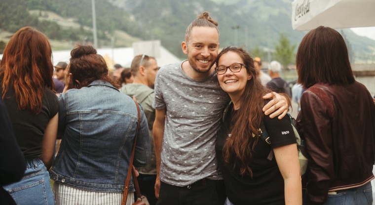
- Humanize, humanize and humanize! Because, yes, behind our Services lie a variety of Loycomates who make up the strength and authenticity of our organization.
So this visual facelift was the perfect opportunity to bring our image even closer to our values. - DIVERSIFY.
This word deserves its capital letters.
On a more serious note, with the amount of content we produce during the year, it was essential to have greater flexibility and visual diversity to enrich creative possibilities.
In short, we wanted to create an image more representative of the quality and variety of the Services we offer, while reflecting our values and commitments to the full.But such a project is not without its challenges. From the outset, two priorities were identified:
- Evolve without rendering our old media obsolete.
Our teams use a multitude of documents, so it was crucial to maintain a link with our existing visual identity to ease the transition. - Maintaining consistency in diversity.
With so much content to produce for various Services, it was imperative to ensure consistency in our visual communication, while maintaining the uniqueness of each Service.
The key elements of this redesign
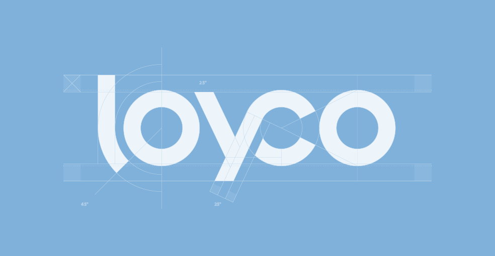
Our logo
As you may have noticed, our logo has been subtly revisited by our graphic designers.
Although discreet for the general public, the changes preserve the essence of our brand while injecting a touch of modernity. 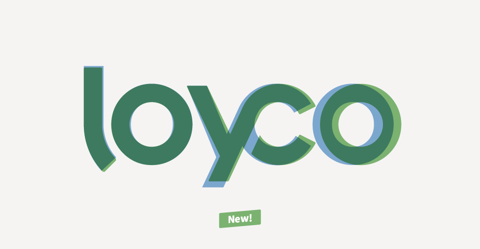
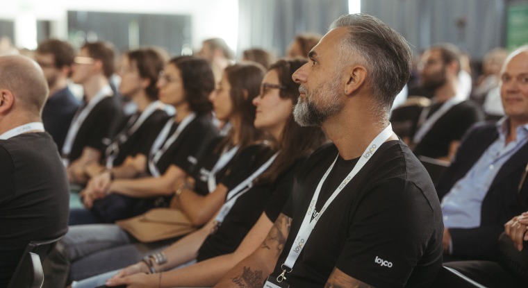
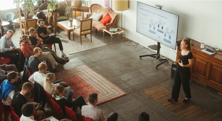
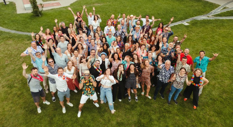
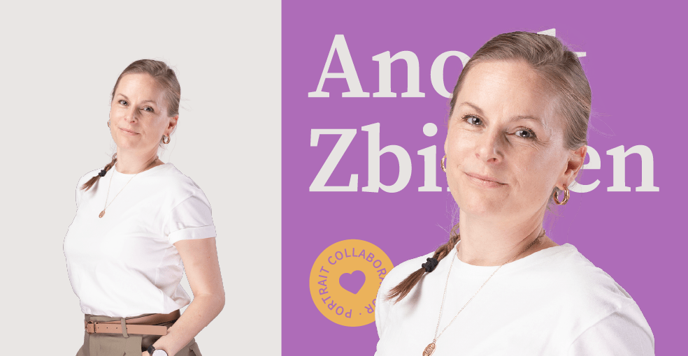
Loycomates portraits
Our Loycomates also played the game and took part in the photo shoot. The result? Staff portraits that add a human dimension to our media and offer a more personal and warm connection for those discovering our world. As our teams grow, not all our Loycomates have their own photo yet, but we’re working on it!
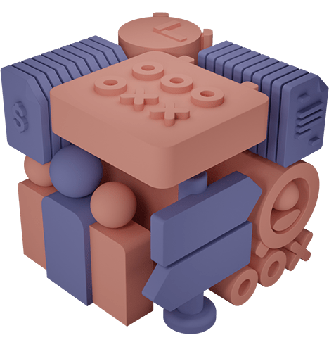
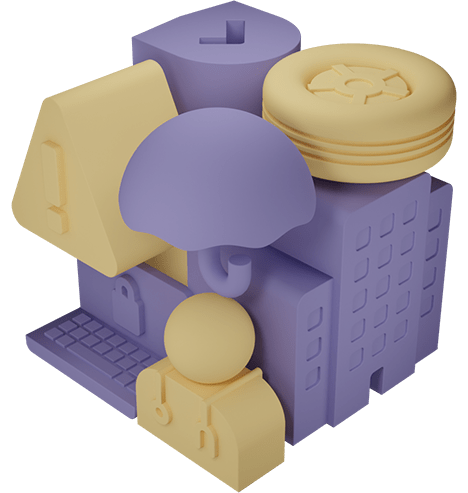
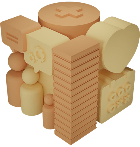
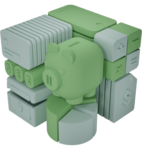
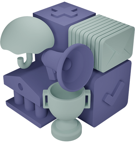
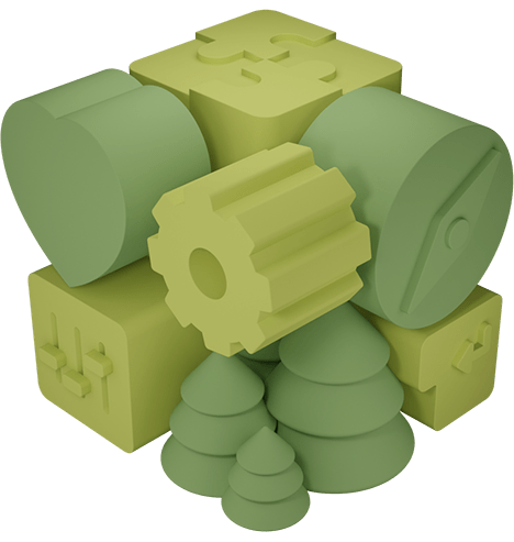
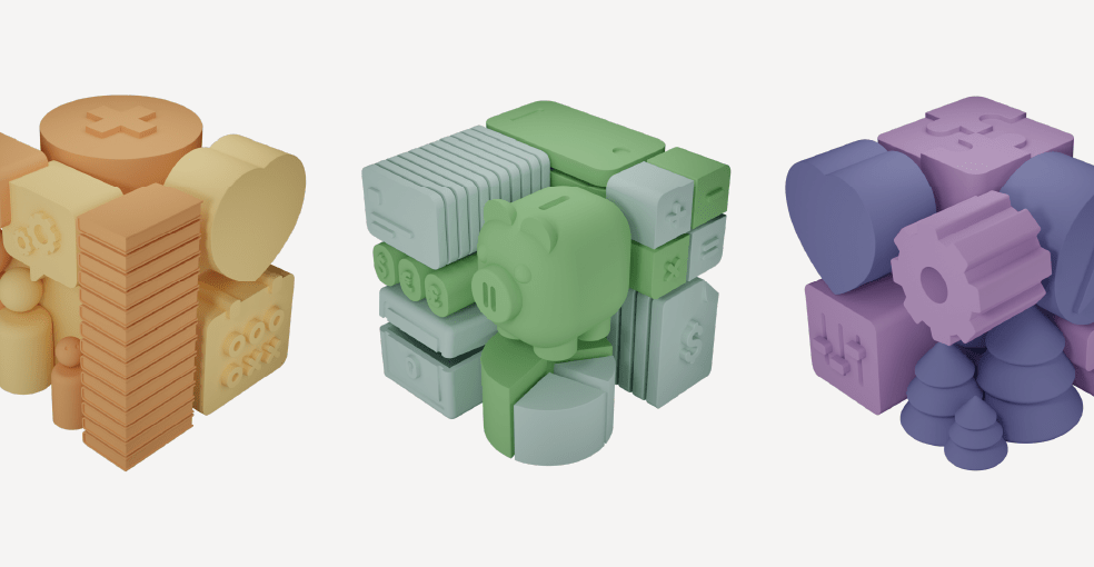
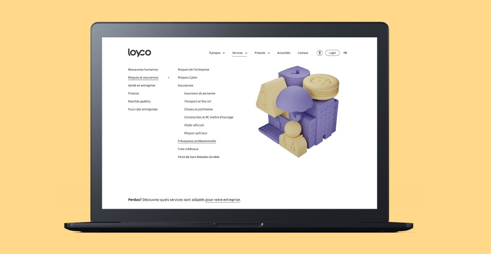
3D visuals for each service
To meet the challenge of representing each of our Services while maintaining visual consistency, 3D cubes have made their appearance in our visual universe.
Each cube includes graphic elements related to the Services it symbolizes. In the case of finance, for example, there’s a piggy bank, a calculator, statistics…
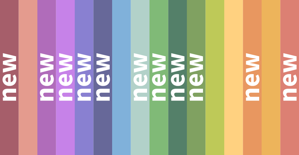
An expanded color palette
More colors? Absolutely! While retaining our 5 basic colors, our palette has been enriched with a multitude of variations. This wide choice, spanning the entire color wheel, is also a way of evoking diversity and inclusion: values we hold dear.
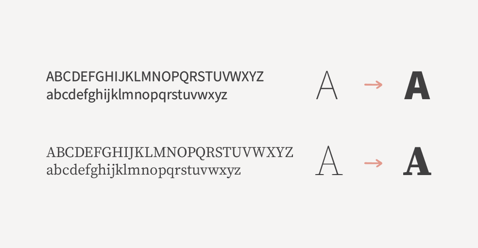
A font that’s easy to deploy
We’ve opted for a royalty-free, easy-to-deploy font made up of two typeface families. Tender offers a wide variety of styles, while contributing to the diversified look of our new corporate identity.
A website redesigned for simplicity
But that’s not all!
In parallel with this visual renewal, our website has undergone a complete overhaul, responding to a number of challenges:
- Showcase the new visual identity across the different pages of the site.
- Bring greater clarity to the site’s architecture and information hierarchy, taking into account the high volume of content and the large number of Services.
- Improve accessibility by offering several visibility options, while remaining aesthetically appealing.
Focus on new products
A new menu for simplified navigation
The first major development: a new menu that provides a clear overview of all our Tender Services. More fluid and intuitive, this new navigation allows you to quickly find the information you’re looking for, without getting lost along the way.
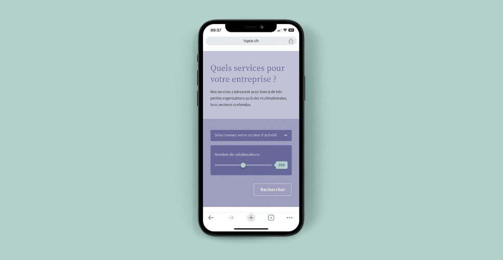
A Services sorting module to refine searches
Another new feature is a Services sorting and filtering module. The aim? To enable users to find exactly what they need by specifying their requirements in just a few clicks. Whether you’re looking for a specific service or just curious, this selector simplifies your search and directs you to what you need.
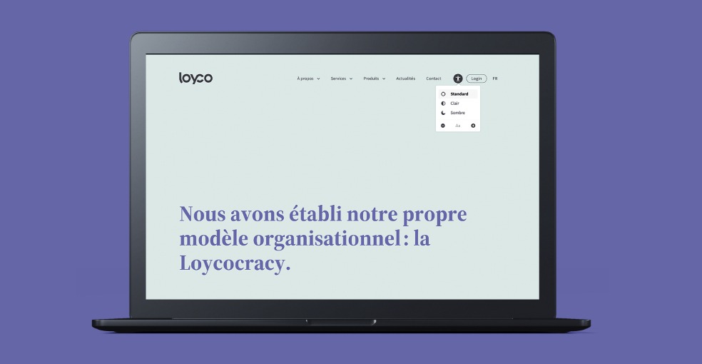
A variety of accessibility modes
Accessibility was also a central issue in this redesign. We wanted everyone to be able to navigate the site without difficulty. That’s why we’ve added several visibility options: a dark mode, a light mode and the ability to change the size of text and images. This improvement required a number of upstream considerations, including limiting the number of colors used per page to two.
An evolving project
Like many of our projects, this work is part of a continuous improvement process: various elements will continue to evolve over time to better meet the needs of our Loycomates and users, while reflecting our values and commitments.
We’d like to take this opportunity to thank all those involved in the project, as well as our Guru marketing team, who orchestrated the project brilliantly. We hope you’ll be as enthusiastic about these new developments as we are.